Most launch spaces are already dense with attention points. A media wall. A plinth. A stage. Light up letters bring the eye to a single line that can be read from the far side of the room. They work because type is immediate. People move toward it without instruction, which helps set the arc for photography and video. Event teams use them in three simple ways:
- Spell the brand name so it reads in every wide shot
- Mark the launch year or date for instant context
- Place a short word that fits the story, such as NEW or NOW
In practice, this turns a busy event into a legible one. Guests know where to stand. Photographers know where to shoot. Social teams recognise which frame will travel best online. Three simple ways to use light up letters at a launch
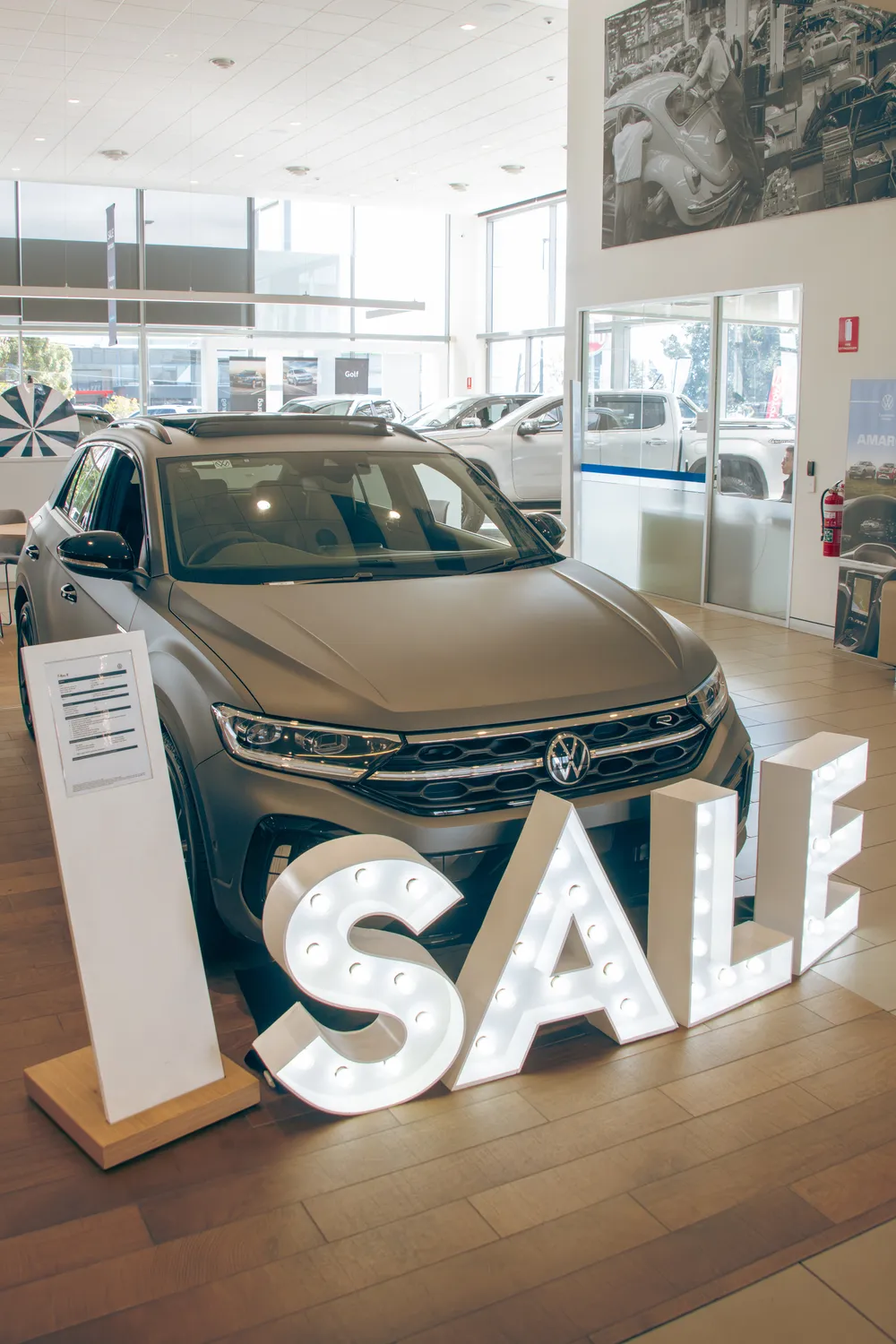
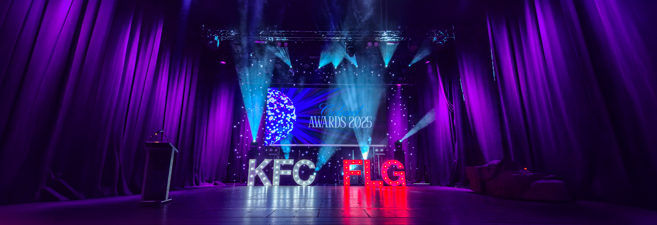
The value of light up letters at launches is technical as much as visual. Consistent LED colour temperature sets a base level that suits mirrorless cameras and phones alike. The faces of the letters are broad enough to reflect soft light back onto products and people. The edges are crisp, which helps autofocus in low light.
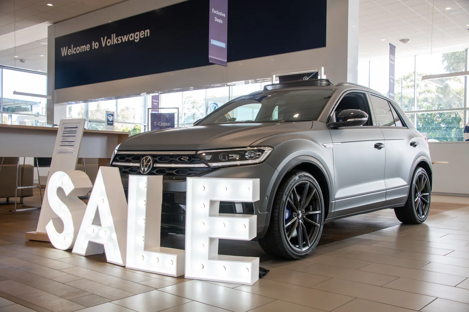
Placement is deliberate. Letters sit behind the product arc, not on it. They stay visible from key angles but do not compete with hero lighting. A one metre height reads cleanly in the frame and avoids cropping heads in group shots. For outdoor courtyards, stabilised bases and tidy cable runs keep sets safe and clean.
Details that protect image quality include:
- Even letter spacing to avoid jitter in video capture
- Baselines aligned with plinths and lecterns for visual continuity
- A quick exposure test with and without haze to check for flare
Placement and exposure guidelines for clean frames
For marketing managers, the appeal of event letters is practical. One element solves several needs. Wayfinding, backdrop and message sit in the same line. Hire models keep budgets predictable and allow scale up for larger venues without storage concerns. A neutral white finish pairs with brand colours on lighting rigs and screens.
On the day, a short checklist keeps production on track:
- Confirm word choice early so approvals are simple
- Lock sightlines from the main camera positions before doors open
- Run a ten second video test to confirm flicker free LEDs
- Capture a clean plate of the set for composite edits later
- Agree on a house exposure reference so different shooters match looks
Fast pre event checklist for marketing teams
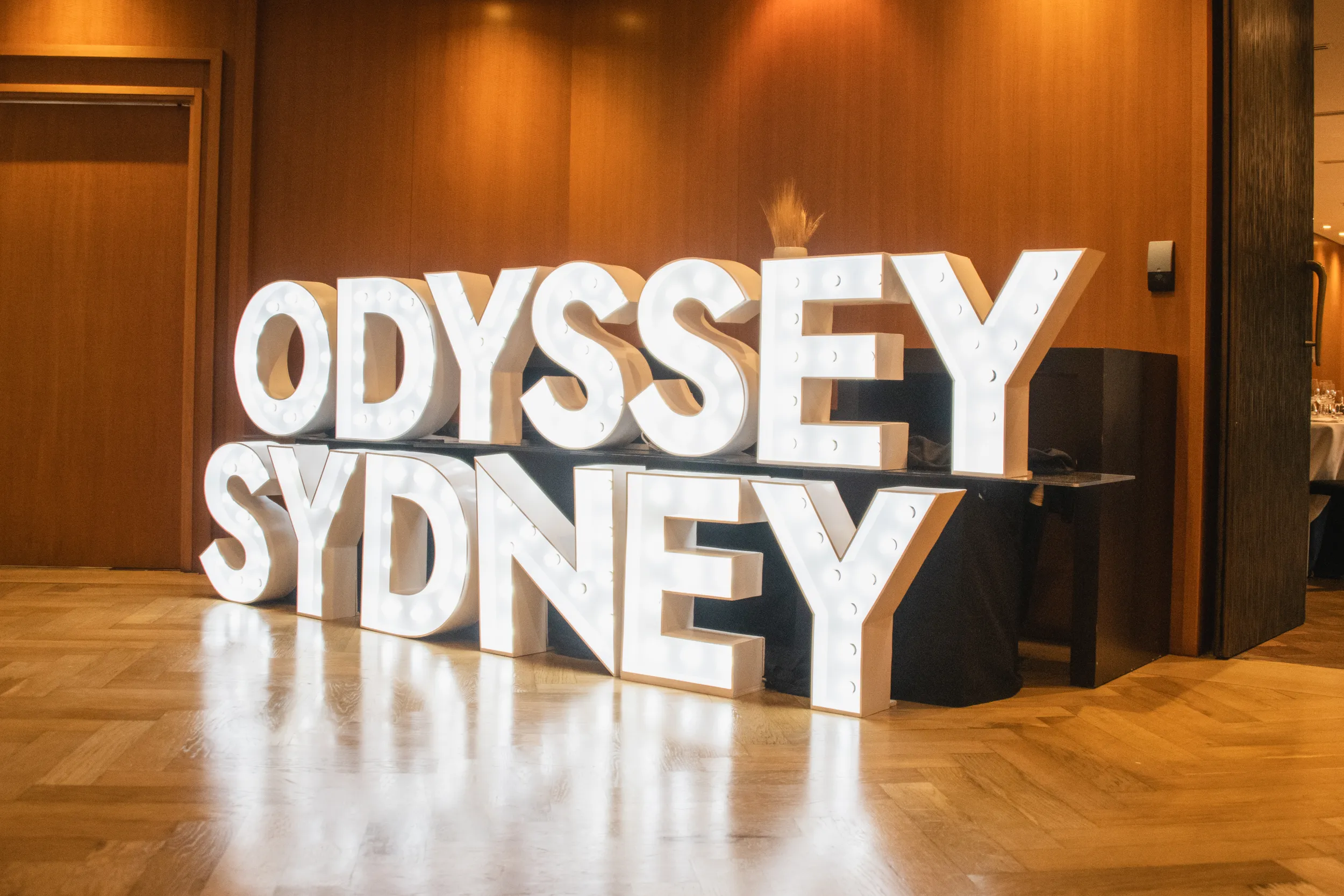
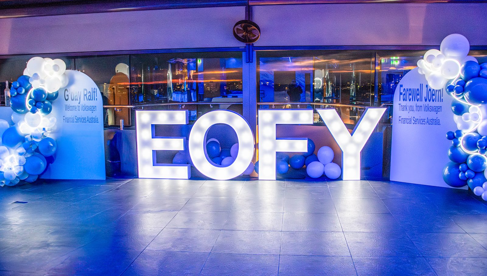
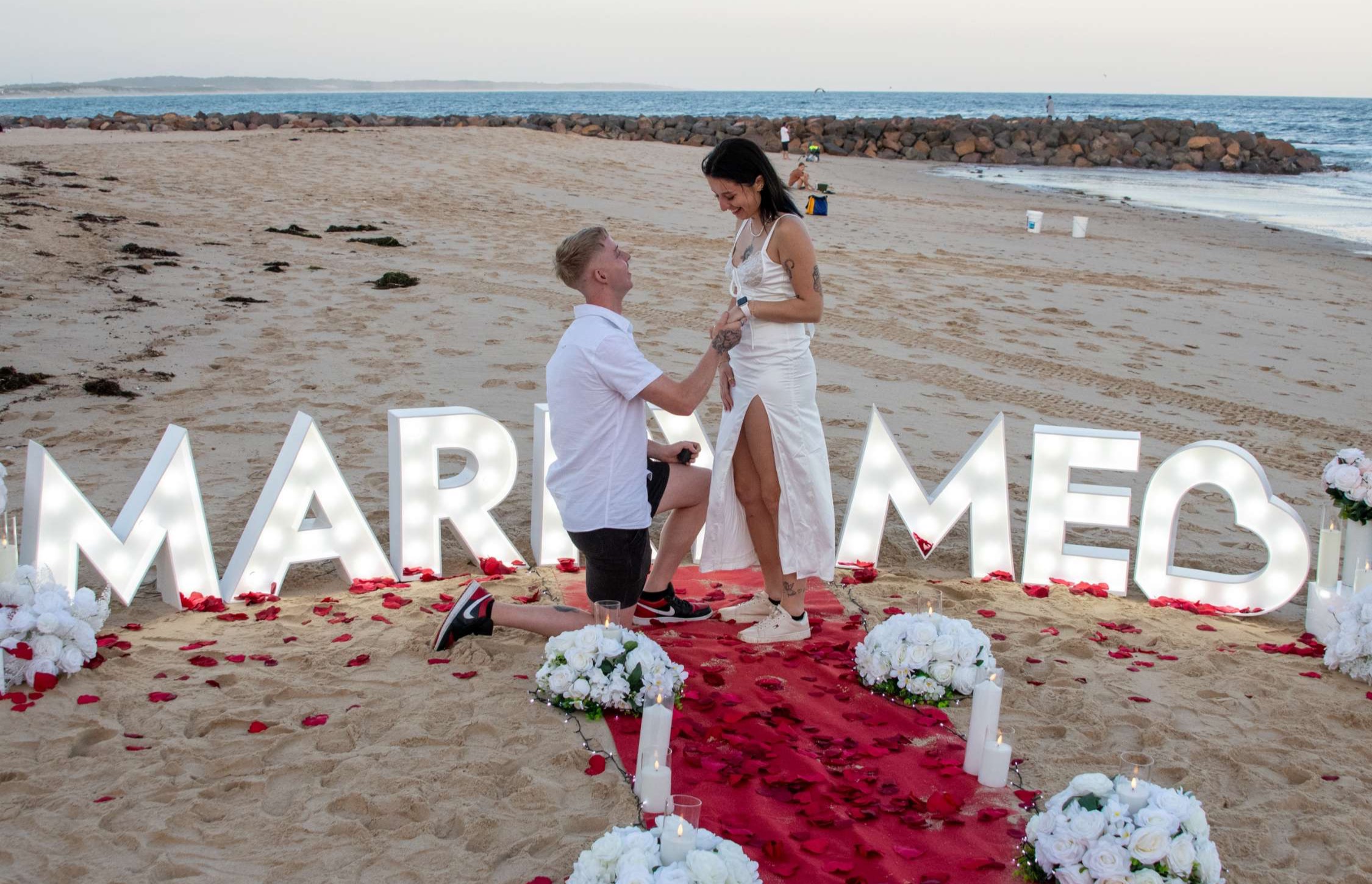
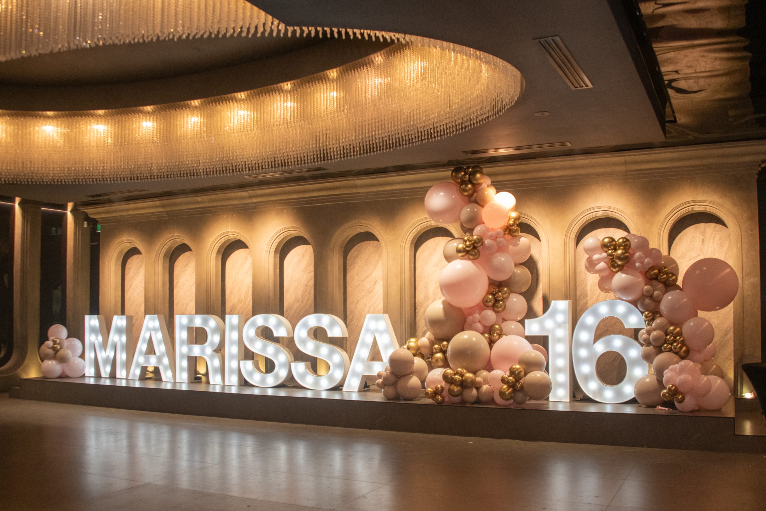
Different sectors adapt the same idea with small changes. Tech launches tend to use all caps and a tight grid that echoes interface design. Retail prefers looser spacing and a warmer tone so products feel tactile. Hospitality uses letter lights to define tasting zones or chef stations, which makes press images easier to caption later.
Common patterns are emerging:
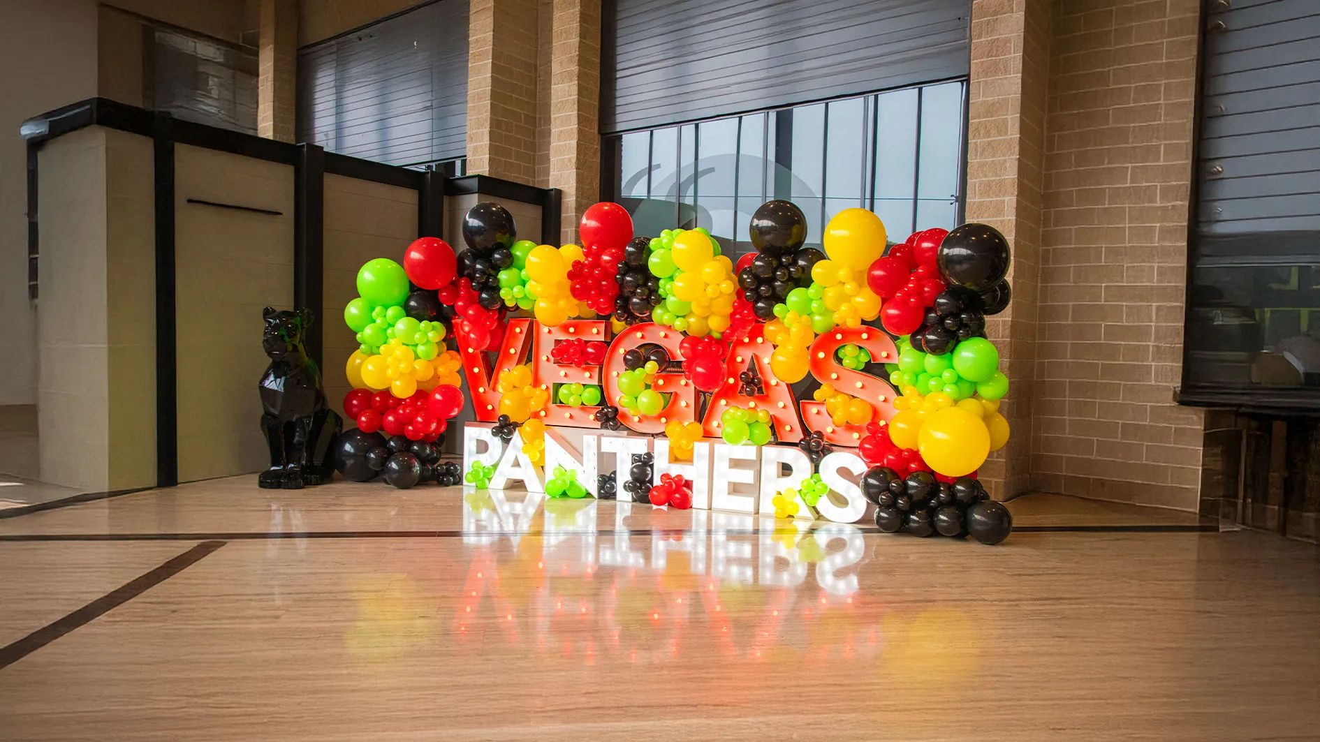
- New devices: brand name plus the model line
- Fashion drops: collection title with season or year
- Venue openings: suburb name used as a place marker
- Food and beverage: the hero product name set near the pass
None of this reads as loud. It reads as considered staging. The tone is editorial rather than promotional, which is why it photographs well and sits neatly in press kits.
Good looks rely on good logistics. Setups are fast when the pre plan is clear. Venues differ, so teams check ceiling height, power access, access paths and load limits before install.
Useful standards for smoother launches:
- Power: confirm standard outlets and avoid overloading circuits
- Surfaces: use protective feet or boards on timber and heritage floors
- Cable runs: keep to perimeters and tape cleanly where crossings are unavoidable
- People flow: leave clear egress lines so the set never blocks exits
- Pack down: schedule a window for quiet removal to avoid audio bleed during speeches
Attention to these practical points preserves the set and the room. That protects the photography and the guest experience.
The success of a launch is often judged after the guests have gone. Galleries, reels and carousels carry the story forward. Here, giant letter hire offers simple metrics. If the word is legible in a two second loop, the frame holds attention. If the letters sit behind the product without casting hard shadows, the product remains the hero.
Many teams track how images with the letters perform against images without them. Marked shots often drive stronger recall because the context is embedded in the picture. The letters also help with asset governance. When a still from a Sydney launch is reposted in another market, the brand name and date make the image self contained. That reduces caption edits and preserves brand language as content moves.
Baseline specs for photo and video capture