Inside the Celebration: Letters That Spoke in Colour
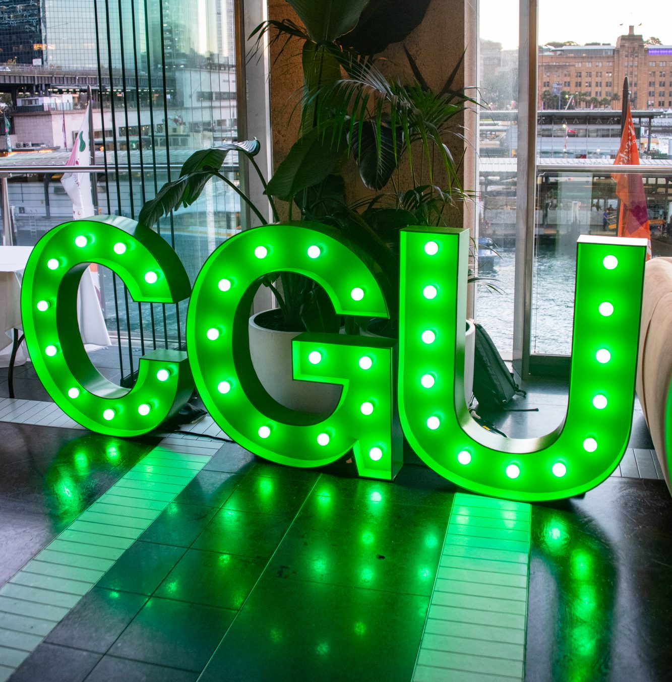
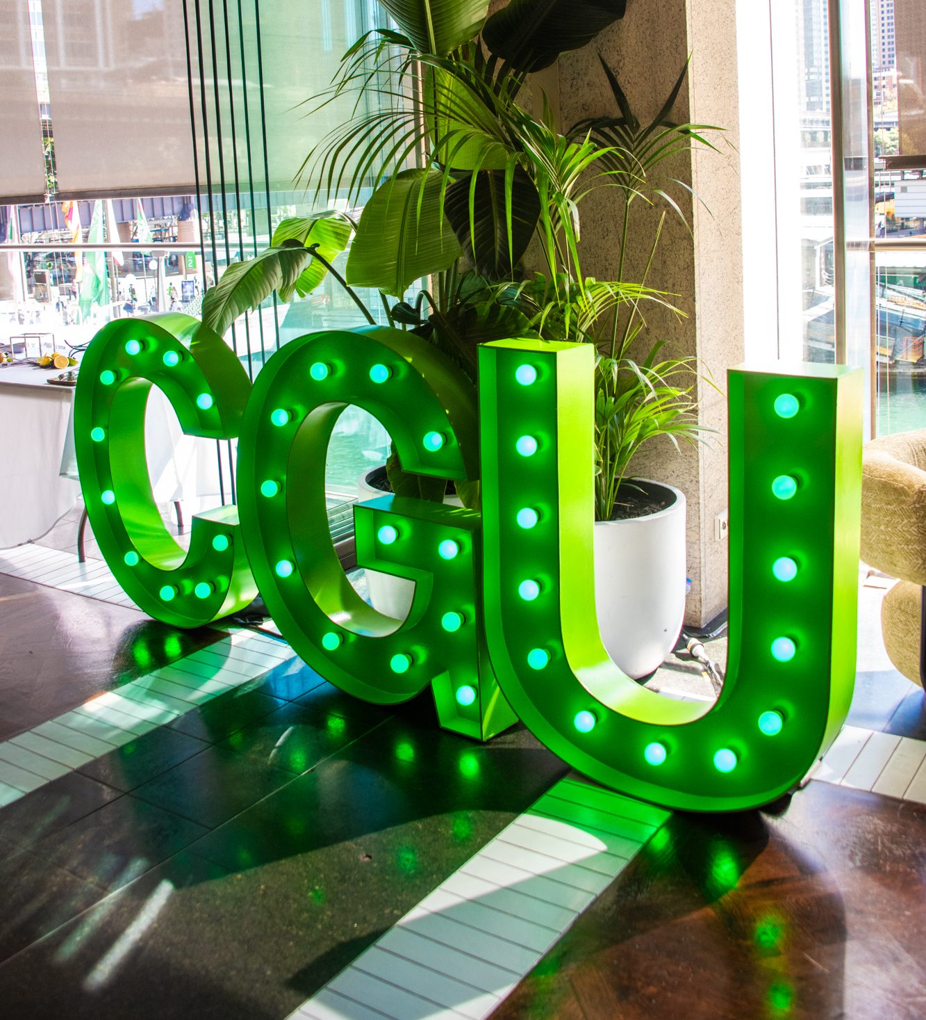
For CGU Insurance, the evening was designed as a client get-together that balanced formality with warmth. In a polished city setting, the arrival of spray-painted letters in the company’s colours immediately gave the space definition. The display was strong but not overpowering. Guests paused in front of it for photos, using it as a marker of the evening and a reminder of who had brought them together.
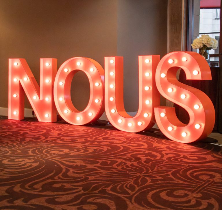
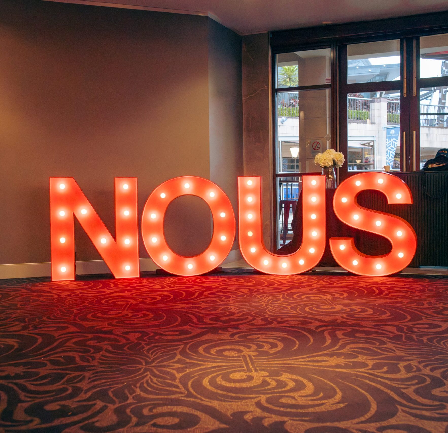
NOUS Software took a different approach, holding a two-day team bonding event where the letters were more than decoration. Painted to match the company’s identity, they were positioned where staff gathered for workshops, discussions and informal dinners. The display acted as a thread through the two days, tying moments together and reinforcing the sense of a shared purpose. It was a quiet gesture that made the event feel more deliberate, and one that participants carried with them beyond the final session.
Designing for Identity
The decision to spray paint the letters was more than an aesthetic choice. For both CGU and NOUS, it was about making the event feel aligned with their identity. Corporate branding is usually expressed through banners, logos and presentation slides. In this case, it was expressed in a form that was tactile and luminous. The letters became a visual shorthand that did not need explanation. They stood in the background, yet shaped the way the space was read and remembered.
Customisation is increasingly sought after in Sydney’s event scene. Companies are looking for ways to make their gatherings feel distinct without overwhelming the format. By tailoring light up letters to match brand colours, the signage takes on more than decorative value. It becomes a form of corporate event letters that blends seamlessly into the environment. Guests are not conscious of it as branding. They simply notice that the space feels connected to the organisation hosting them.
A Backdrop for Connection
At both events, the letters functioned as a natural gathering point. At CGU’s client evening, conversations gravitated towards the display. Photographers and guests used it as a marker for group shots. At NOUS, the letters helped set the stage for moments that were less formal but no less significant. Staff returned to them repeatedly, whether to take photos, to pause between sessions, or to use the display as a meeting point.
In this way, the light up letters were not static props. They worked as a form of branded event signage that supported interaction. They gave people a reason to stop, look and connect, which is exactly what the events themselves were designed to encourage. When letters become more than decoration, they start to shape how people move through a space and how they experience the occasion as a whole.